English version
I am Giedrius Cibulskis. I live and work as a freelance designer in Vilnius, Lithuania. My specialization is logo and brand identity design. Below you can see some of my works.
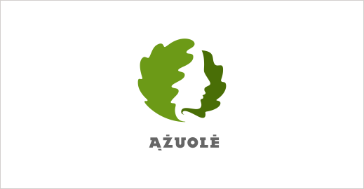
Logo for a high-class private village in Lithuania.
“Ąžuolė” is a Lithuanian female name. It is a feminine version of the tree “oak”.
I also helped the client to go through the naming process of this brand. The name was chosen because of the oaks that grow in the village. The oak is a highly respectable tree in Lithuania and its feminine symbol accurately represents the position of this high-class village.
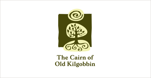
Logo for a 450 ha farm in South Africa.
A lot of things happen in this farm – from weddings to horse riding lessons. And that is why the client wanted a logo to be rich in symbols. She also wanted that the logo would be drawn in a realistic, rustic and earthy style.
The cairn is the central element of the farm. And you can also find a big and very distinct tree growing there. The sun, which is presented like a spiral, is a symbol for the natural and wholesome environment.
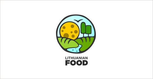
Lithuania is famous for its natural environment. We have lots of trees, rivers, lakes and wide fields.
The food comes from the environment. This is depicted in the logo in a visual way – hills look like bread, trees look like ice cream, sun looks like cheese and river looks like mineral water.
This kind of image communicates a message that Lithuanian food is natural, healthy, harmonious and because of these specific qualities it is good for you.
Logo for the flat roofing company.
From the beginning the client wanted to see the roll incorporated into the logo. According to the brief, the overall composition of the logo should have been original and modern.
Lithuania at Bologna Children’s book fair
At first glance you can see two characters from fairy tales. A grass snake with a crown is an allusion to one of the most popular and unique Lithuanian folk tales “Eglė, the queen of grass snakes“. An owl (wisdom) symbolises answers (which can be found in children’s books) to children’s questions.
Later you can see that these characters resemble pages of a book, and the whole composition comprises the book itself.
Turning a new page is a symbolic invitation to get more acquainted with the Lithuanian children’s literature.
This brand specialises in smoked meat products. The brand stands for the high quality, traditional and natural ways of production.
Composition of the logo is continuous, evolving, and natural. It is simple and at the same time complete, warm and friendly.
Logo for an existential psychologist-psychoterapist.
In the logo you can see two stylized people looking at each other – this is a reflection of a psychotherapeutic relationship process.
Letter psi (Ψ) from the Greek alphabet is a widely acknowledged symbol of psychology. You can see it in the negative space of the logo.
Also, there is a symbolic metaphor for the therapy. In the negative space you can see one path which gets divided into three new paths (new possibilities, new insights etc.)
JSC “Alpera” is a leading design and trading company that produces medals, pins, business gifts, trophies etc. from various metals. (My ex-workplace)
In the logo you can see a capital letter A that is positioned on a stylized medal.
Symbol without the text is used to mark the production of company. Full logo is used in print and on the Internet.
Logo for a ceramic artist Agnė.
You can see three symbols: an embryo, an animal and a fish. These motifs often repeat in Agnė’s works.
The whole abstract composition symbolises Agnė’s creative direction that can be described as free, expressive and spontaneous ceramic art. Three types of stamps are used to mark the products.
Logo for a five star hotel-villa in Turkey.
The client asked for a decorative logo which would reflect the ornamental patterns of the interior design.

